Friday, 28 January 2011


Drafts


Photo Shoot
I wanted to create a image to two teenagers which play guitar and are in a band. I thought of an idea of having to brothers twins to photograph, this is because it would be a unique band and different to everything before. I got two friends which are twins to take the photos of. The background did not matter because I was going to cut it out anyway. I took the pictures inside my house. I used various skills like lighting and positioning. For the light I used a lamp to concentrate on certain points, I only used this lamp on two of the photos; this is because I wanted to focus the attention to the guitar head. This worked very well and I believe it was a success. I used light from the windows and from the flash to create the rest of the images because I wanted a all-round lighting effect not making the audience focus on one point. I made the models stand holding guitars this is because it shows that the play guitar and creates an image of a band. On the double page spread photos one of the models held a amplifier and a guitar which creates an image of a band also. This shot also looks like he is walking which makes a very nice effect on the double page spread. Overall I am very pleased with my photo shoot I got all the photos I wanted for the magazine pages.
Media Final Product photots


I used various different techniques to create these shots. Some of these techniques is looking at the lighting and making sure that you do not get too much light or too little. I also made sure that the people are in the shot and not cut out. I also did some shots landscape so that I can get everyone in the shot. I used these techniques to create these images to be used in my final product.
Flat Plans


Friday, 21 January 2011

Audience reseach


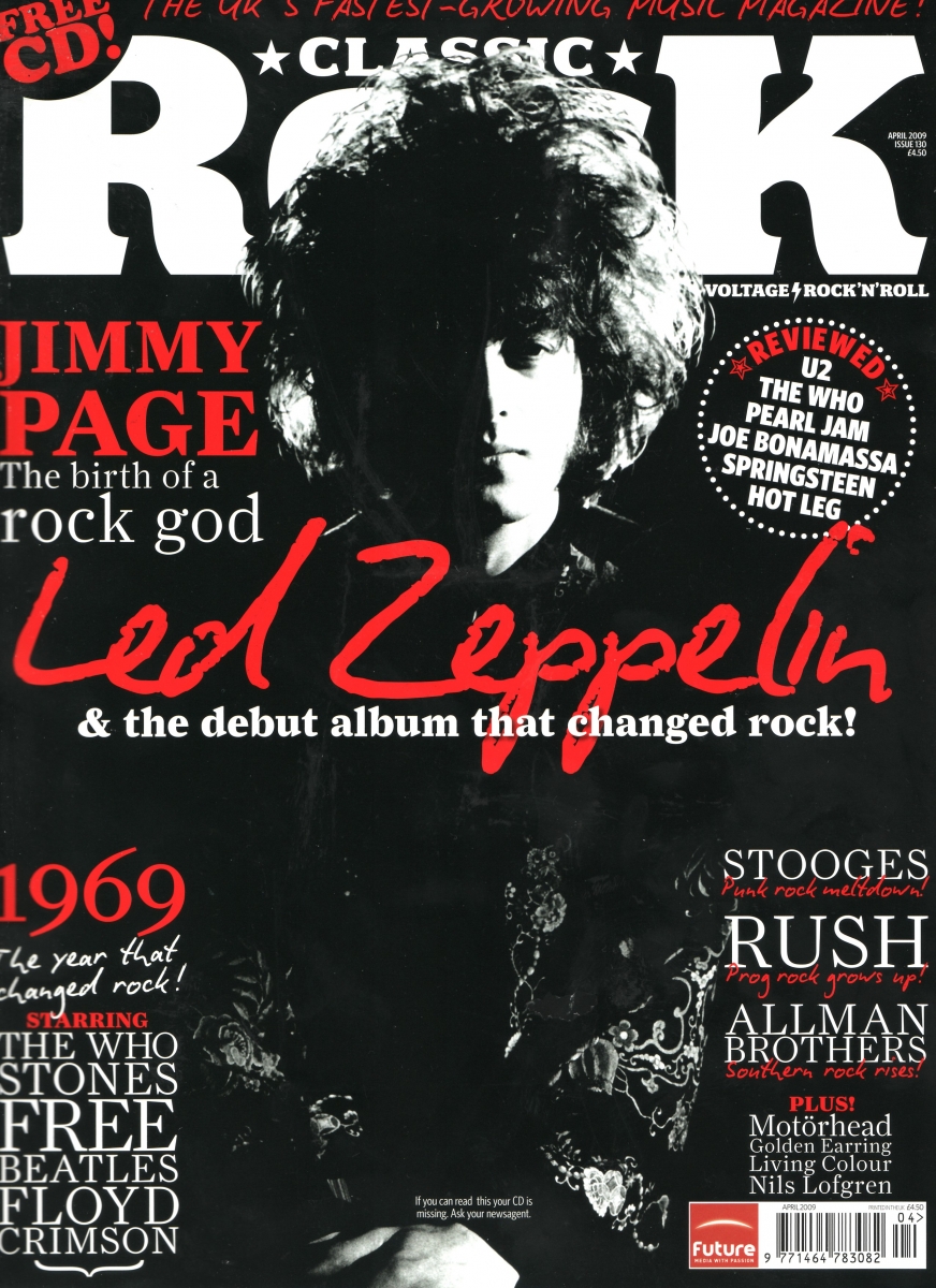
These are some actual music magazines which have been published. I am going to use some of these for inspiration. I have noticed that a lot of the colours on them are black grey gold and red. I believe this works really well to create a classic rock magazine image.
Readership Profile.
 I created this using a focus group which I did with my target audience. I created this readship profile on Photoshop using photos which I believe represents my target audience.
 House styles


This is the house style that I would chose for my music magazine. This is because my music magazine will be classic rock this music magazine will be similar to mine. I think that the front cover is held together very well and the colours work really well together. I also think that the layout is very good but not original, this is because they layout looks like many other music magazines.
Subscribe to:
Comments (Atom)